Client
TIST
DELIVERABLES
uX design
UI DESIGN
ILLUSTRATIONS
Year
2025
Role
MID UX Designer


The lack of centralization, made monitoring costly and inefficient, often requiring long verification processes to gather evidence for groups that might drop off and long waiting periods to receive cash incentives, resulting in the risk of TIST being perceived as an untrustworthy organization.
When the project was handed to me, it had already been worked by another team for the past month, but it was approached purely from a graphic design perspective.
After me and my team lead reviewed the prototype, we quickly realized it lacked intuitiveness and clear feedback mechanisms, but we had a major issue… the delivery date was less than two weeks away.
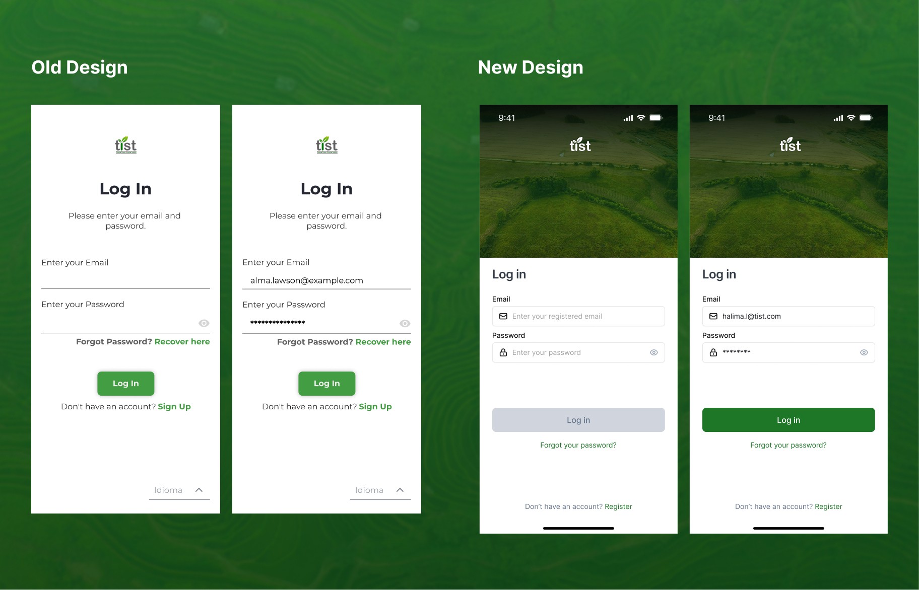
Old Design


We already had a design system used on a previous project, "TIST's learning platform", so the look & feel for the new app, ensuring visual consistency across all our TIST's products.
Our main task was to rethink the user experience from the ground up, creating a flow that would guide Cluster Servants through the registration, while keeping the interface aligned with TIST’s visual identity and functional requirements.
To achieve the goal in a structured way that ensures the fullfillment of our user needs, we decided to use the Design Thinking framework.
Empathize

As a result of previous 35 online interviews with Kenya's Cluster Servants, (made by the instructional team) we were given a document with valuable findings. The interview explored their main duties as Clusters, main stoppers during the application process and the technical difficulties they faced. But something lighted up, there was a high tendency of errors during the group's applications process.
Wanting to know more about this specific problem, I managed a meeting with a Cambridge representative who worked directly with TIST'S Kenyan branch. He explained that some tree's species were known with a different name in each region, sometimes ending in farmers lying about the tree species they had. This made the Cluster Servants have a really hard time figuring out the species just by name, but for us, it also represented an opportunity to turn this problem into a design opportunity.
DEFINITION
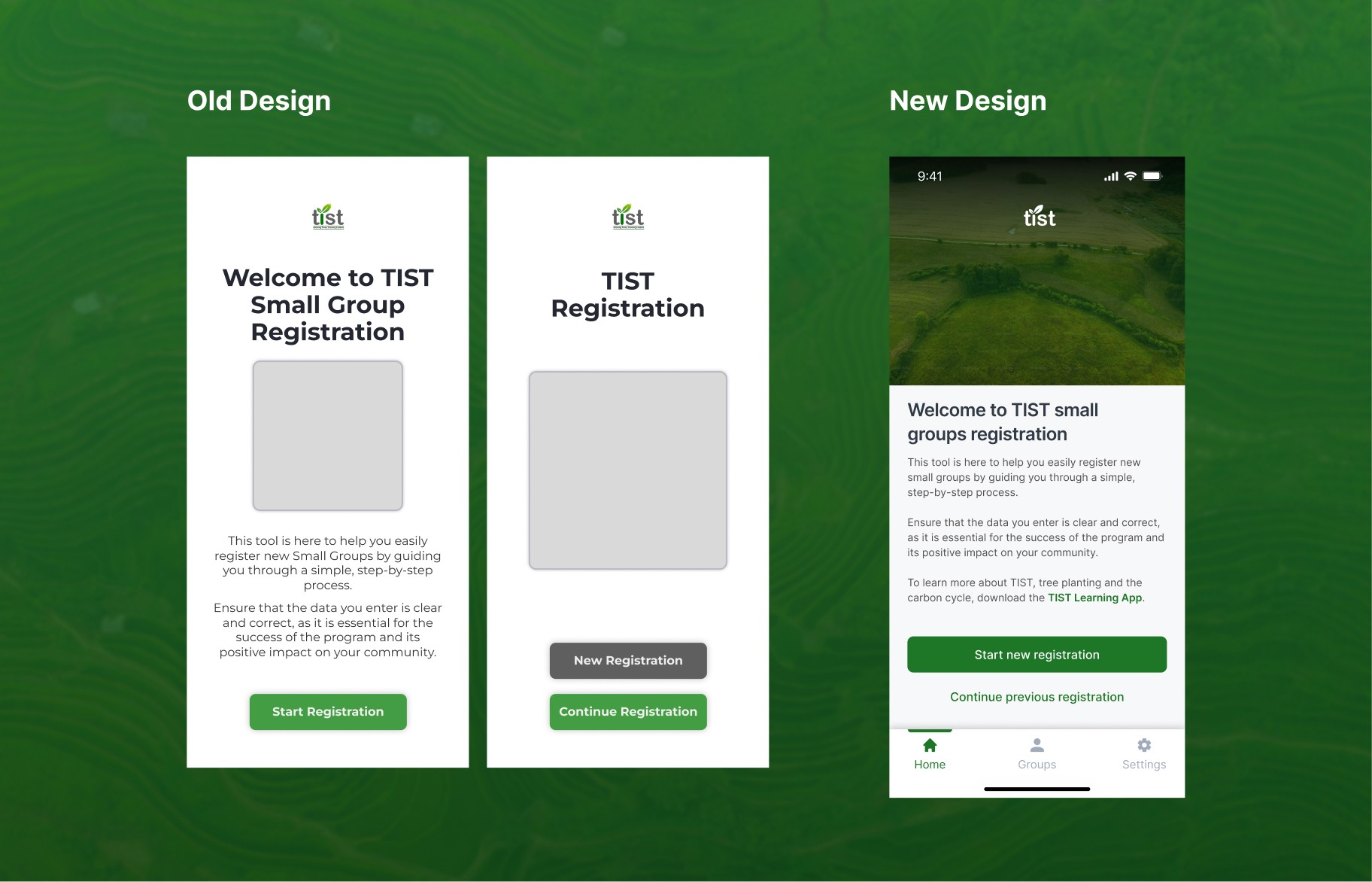
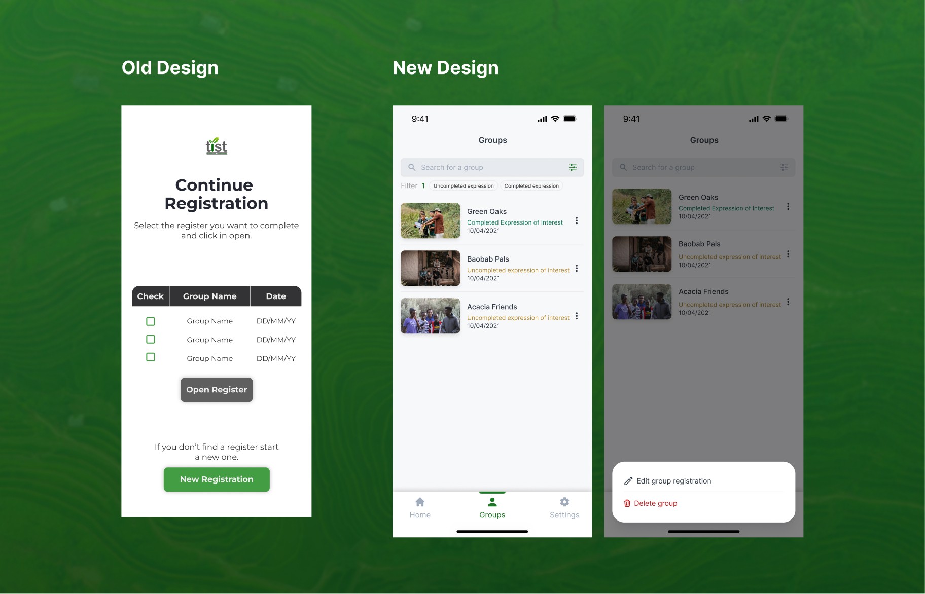
With the help of my team lead, the interview's findings and the information provided by the company's instructional team, we first began mapping the user journey and reorganizing the registration process into clear, sequential sections:
01
Group name, geolocation and group photo.
02
Personal data, ID, photos and phone number.
03
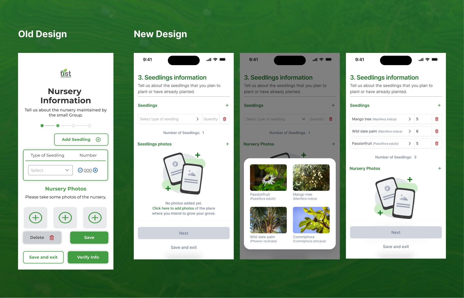
Seedlings, land's details and verification photos.
04
Ongoing updates on tree growth and quality.


IDEATION
Once the user journey was mapped, the new duty was to bring the ideas into high-fidelity interfaces. With the previously stablished design system, I designed base screens, modals, illustrations and gathered images for the whole flow. With the guidance of my team lead I reiterated several screens until we were satisfied with the final layout, as we weren't fully convinced they fitted the proposal's goal.
I validated this mockups with the instructional design lead in charge of the project, but apart from changes in the copy, we didn't get further feedback.

PROTOTYPING
Once we had green light over the screens, I rushed to assemble them into a functional protoype, so we would be able to test if it runned smoothly from end to end for the stakeholder's demo.


Iteration and feedback
During stakeholder review, we received highly positive feedback. The interactive prototype was particularly valuable, as it clearly demonstrated the intended navigation and flow of the registration process.

TEST
Once we finished implementing the received feedback, we relaunched the prototype for Cambridge, Yeltic and a selected group of Cluster servants to complete the initial testing phase, focusing on usability and accesibility, to fully ensure the app was covering the main pain points in the group application's process.

The project was ultimately approved by TIST and Cambridge, it was developed and launched on the last month of 2025. "The Small Groups Registration App" is currently being used as the main registration tool in Kenya's TIST branch, and while it is still in process to be adopted by the other branches, the project has already:
70%
100%
Transcription
avoidance
95%
App's adoption
rate (Kenya)
But it doesn't end there…
Presenting it directly to stakeholders and showcasing the flow through a functional prototype, actually opened a door for an upcoming 2026 project where it's planned to overcome the second step of the registration process, it is still on the talks, but I have already been asked to do the proposal's prototype.


Gathering data, empathizing with the user and analyzing graphic design's previous proposal to identify pain points and rearchitecture the flow.
Apply the previous design system from TIST's learning platform, adapt it to match the new requirements and iterate the final screens to ensure usability, while validating with stakeholders and team leaders.
Show intended navigation process, so the stakeholders could visualize the proposal's flow.
For the handoff, I was asked to make a live demo with the protoype for a TIST representative, where I was able to explain how the added features in the proposal would simplify the registration process.